Sector
Video games
Client
Square Enix (Academic)
Timeline
~2 weeks
Tools
Mural, Figma
PROJECT SCOPE
GOAL
Design screens from the minigame's core gameplay loop within the constraints of mobile screens and controls.
View the prototype
GAME OVERVIEW
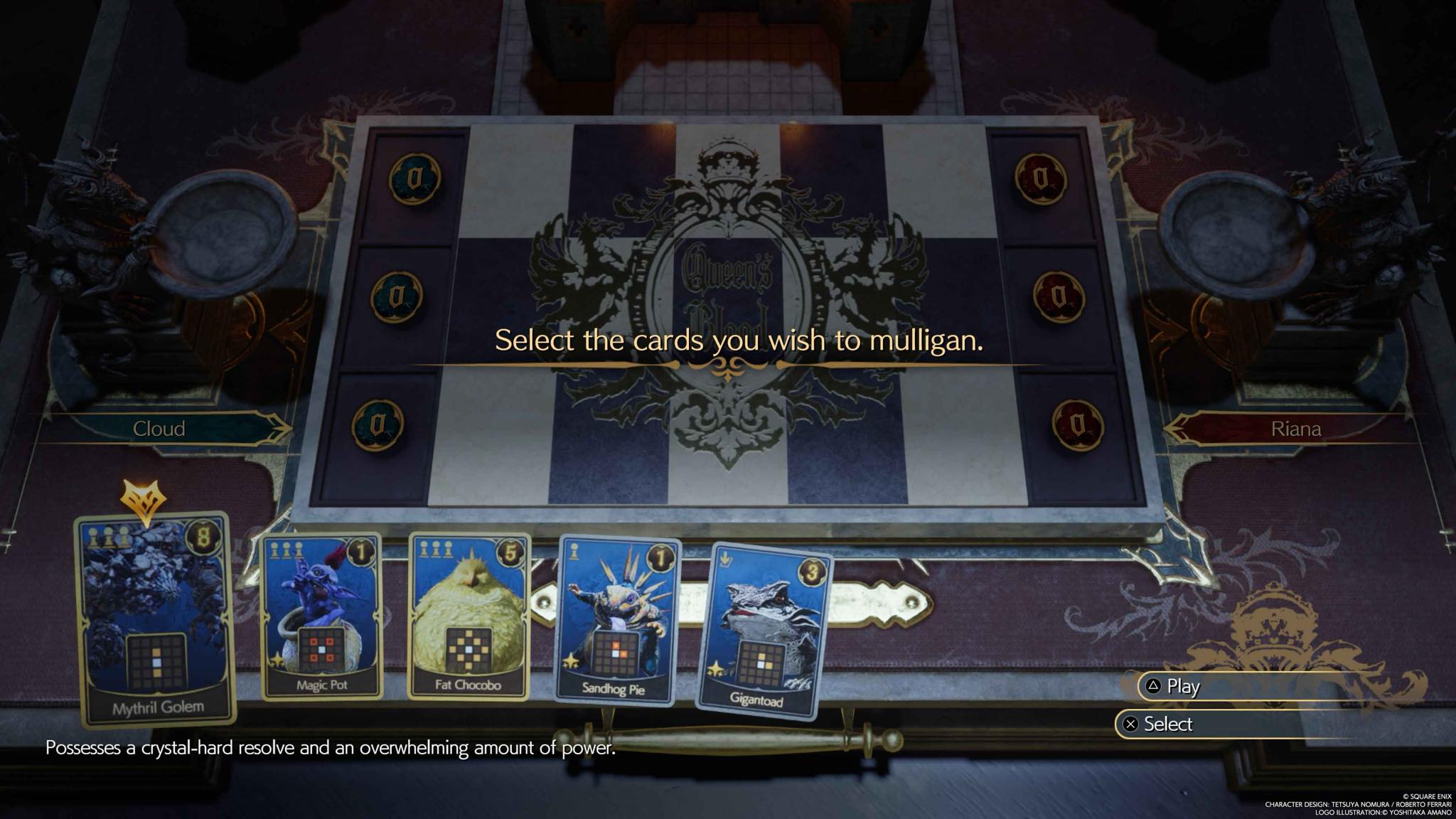
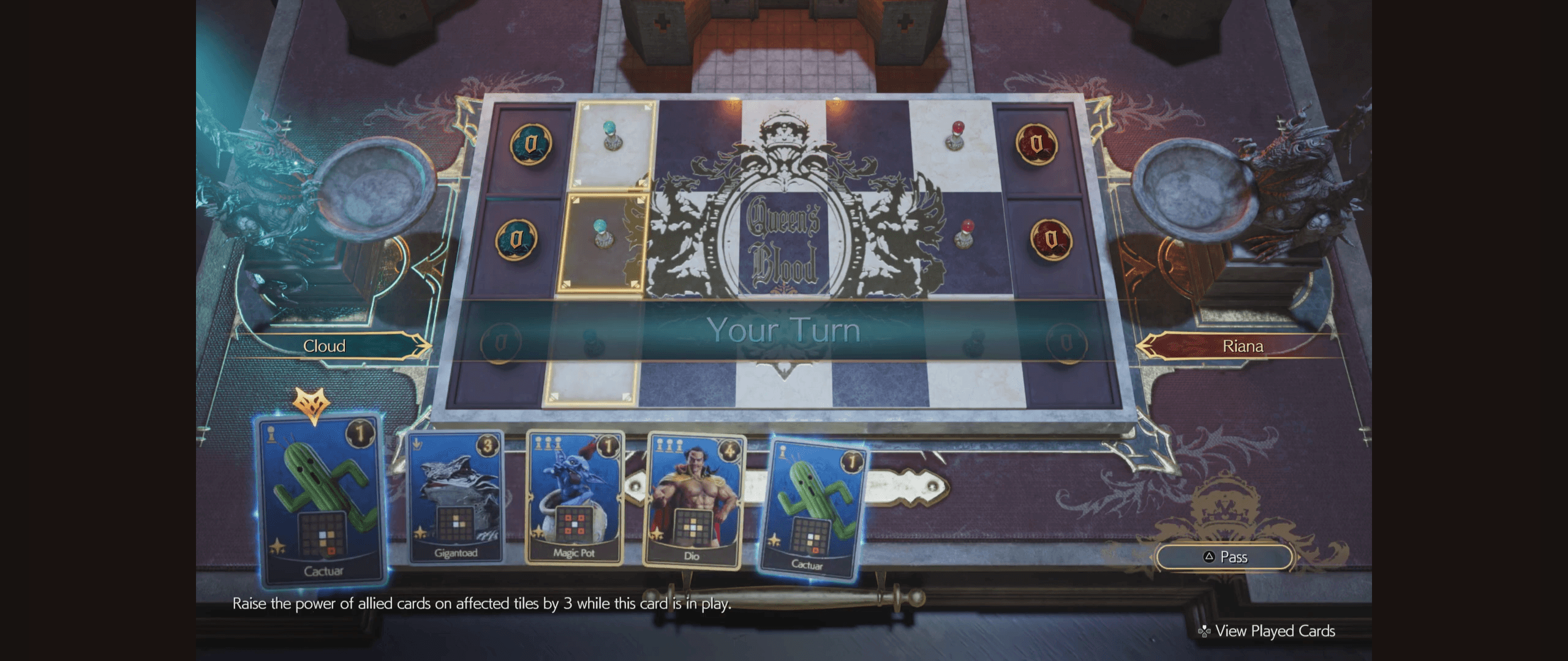
Queen's Blood is a minigame that was newly introduced in the second instalment of Final Fantasy VII's (FFVII) re-release trilogy: FFVII Rebirth. In this 2D person-vs.-computer collectible card game (CCG), players strategize how to play a deck of point-valued cards onto a contained grid to accumulate a higher sum than their opponent.
Key mechanics
Cost
Each card costs 1-3 pawns to play. Each position indicates what cards can be placed there based on its pawn count, or rank.
Power
Each card has its own value i.e. points that is added to the lane (row) it is placed within. The sum of points across the lanes determines the winner.
Ability
A card impacts positions on the board by raising their rank. Some cards can also affect the power of cards already on the board, or will be later.
Core gameplay
The core gameplay loop is made up of two stages that involve the points collection system:
Match start: The player can select cards to mullligan
Player turn: The player can either select a card to play, or pass
To play, place a card on the board
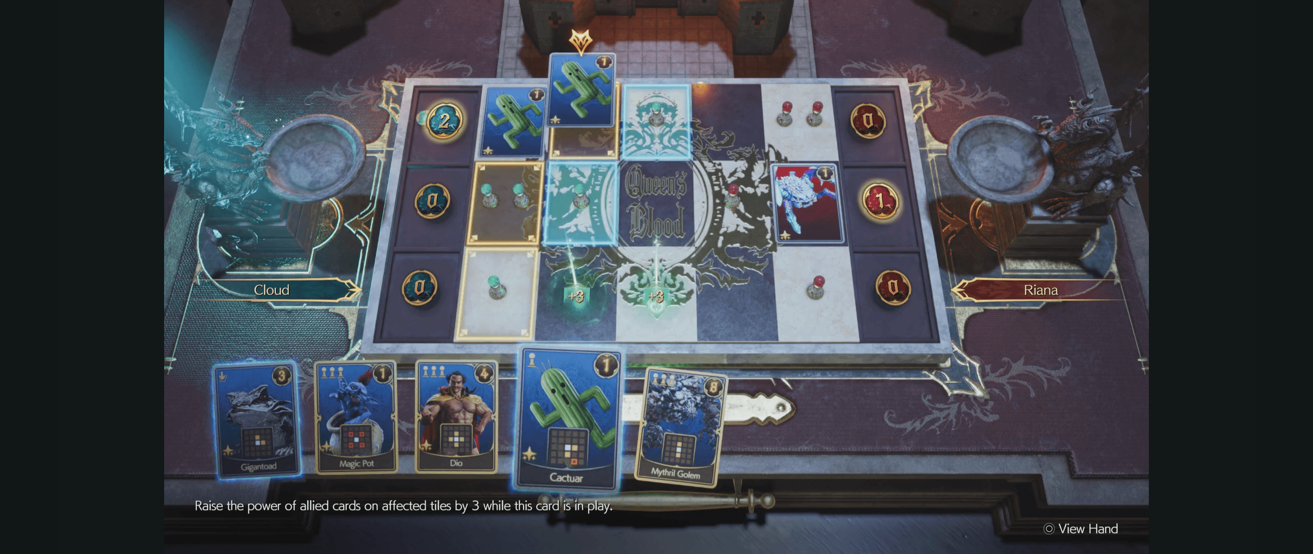
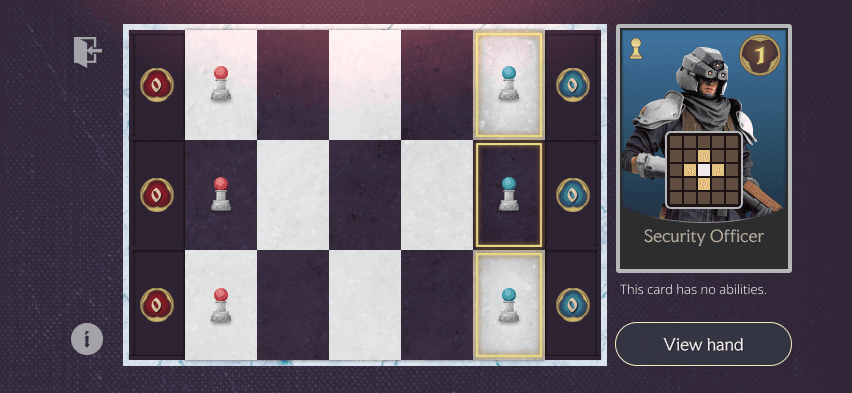
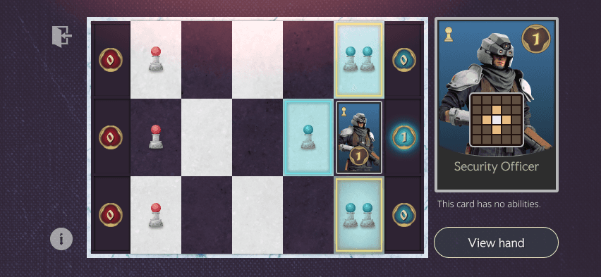
The player can hover over a card in their hand to see where it can be placed on the board. Positions tinted yellow indicate where the card can be placed, while those tinted blue would earn +1 rank, represented by the single pawns.
In the adjacent picture, the player has selected the Cactuar card. This card has the added ability to raise the power of an allied card by +3, should it be placed in the position highlighted in red on the card itself.
Screen when hovering over positions
WIREFRAMES
I first explored several low- to mid-fidelity wireframes to get a sense of an appropriate hierarchy for interface elements.
Moving onto high-fidelity mock-ups, I designed the screens seen during Queen's Blood's core gameplay for iOS (specifically using iPhone 16 dimensions, but responsive to other mobile devices).
The following screens are made up of five main components:
Play area
Player hand
Player action
Tutorial access
Game exit
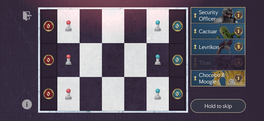
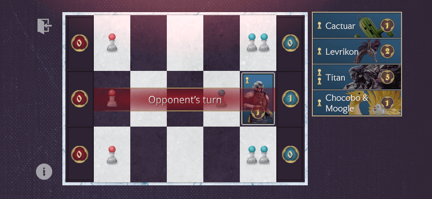
Turn starts: Cards that cannot be played remain in the player's hand, but is displayed at a lower opacity. If the player holds the skip button, a colour-change animation will convey confirmation feedback.
Card selected: The selected card now replaces the view of the hand to instead display its abilities. On the board, the yellow outline distinguishes which positions the card can be played on.
Card previewed: By tapping any of the yellow-outlined positions, the player can preview its effect on positions tinted with blue. They can still select other positions to see how the effect varies.
Card placed: Tapping the position the card is currently placed in will confirm its play and end the player's turn. At the start of their next turn, a new card will be added to their hand.
Overcoming challenges
Imagining a Queen's Blood mobile port relies, to some extent, a visually believable proof of concept. I knew I wanted to use existing Square Enix assets, such as character models, but these proved to be very difficult to locate – even more-so for anything unique to the mini-game, like the board.
I ended up producing many components from scratch in Figma using my knowledge of adjacent tools in Adobe Illustrator that I have used to create shapes, icons and gradients. Without access to the exact typefaces used throughout FFVII either, I examined their characteristics referencing menus and heads-up displays (HUDs) to identify close matches.
DESK RESEARCH
In adapting a console mini-game to mobile screens, there were several considerations to be aware of. Not only is the screen size significantly smaller, but input controls are entirely different. For example, mobile interactions do not involve a hover state.
My research uncovered three areas of mobile game design and I set out to investigate how other digital CCGs accommodate them:
Limiting clutter so that each UI element could be easily visible and readable
Implementing touch gestures to mimic familiar inputs across console or PC controls
Confirming player input by providing feedback
Questions and findings
What are the dimensions required for elements to be visible across devices?
Hit targets for interactive elements: 44px by 44px
Body text: Minimum 16pt
Captions: Minimum 11pt
What other mobile CCGs have existed in other formats before mobile?
GWENT: The Witcher Card Game
Magic the Gathering: Arena
Hearthstone
What touch gestures do these games adopt for intuitive gameplay controls?
Long-press a card to view its information in more detail
Hold and drag a card from the hand to the desired position on the board
How do these games offer feedback to player input?
Use animations on an active control before moving to the next screen
App reviews
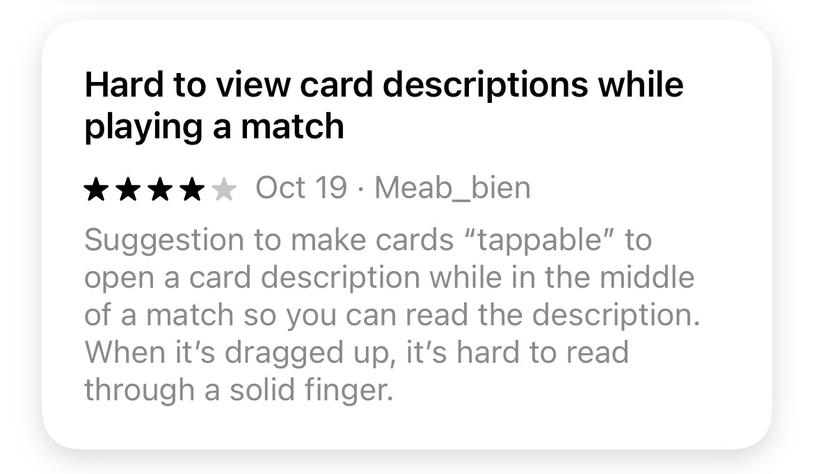
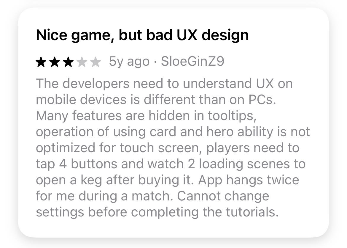
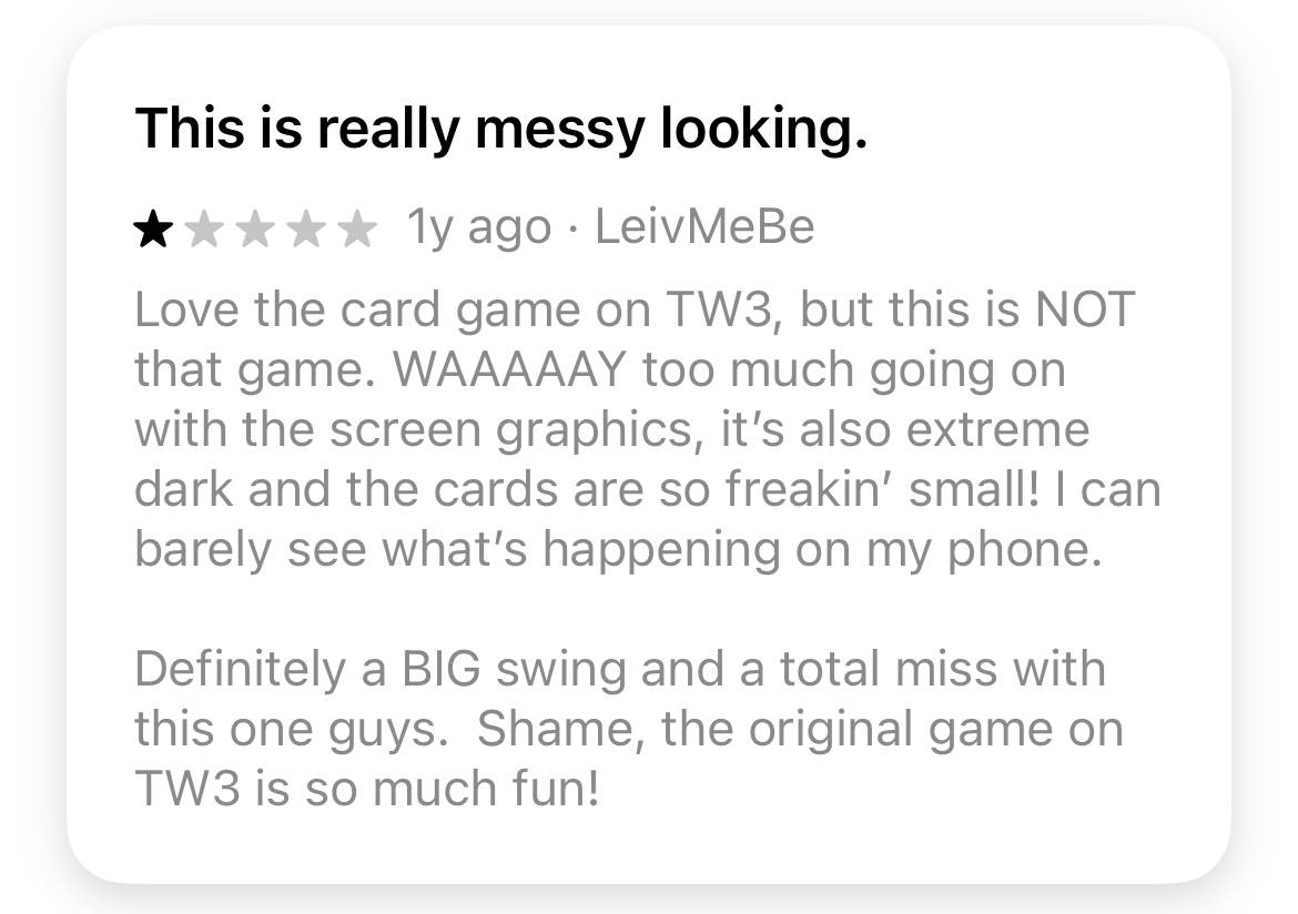
I also looked at reviews for mobile CCGs, searching for any feedback on the design decisions outlined above and how players responded to them during gameplay. I found that MTG: Arena seemed to mitigate small text on the cards by integrating a long-press control to enlarge a card's detail. However, a player shared in doing so, their finger would obstruct the reading pane. GWENT players appear to similarly struggle with small text, as well as difficulty navigating information.
CORE ISSUES
While referencing other CCGs was a helpful exercise in identifying potential UI patterns I could use, I still encountered a few challenges that I expect are common for any console-to-mobile port.
Design
Defining the 'safe' area
Issue
Preset mobile frames on Figma have less space after accounting for device bezels and notches.
Solution
Overlayed a true-to-scale phone model to establish gridlines and margins against.
Impact
Reduced interface clutter and noise through ample white space surrounding UI elements.
Translating card details to a smaller size
Issue
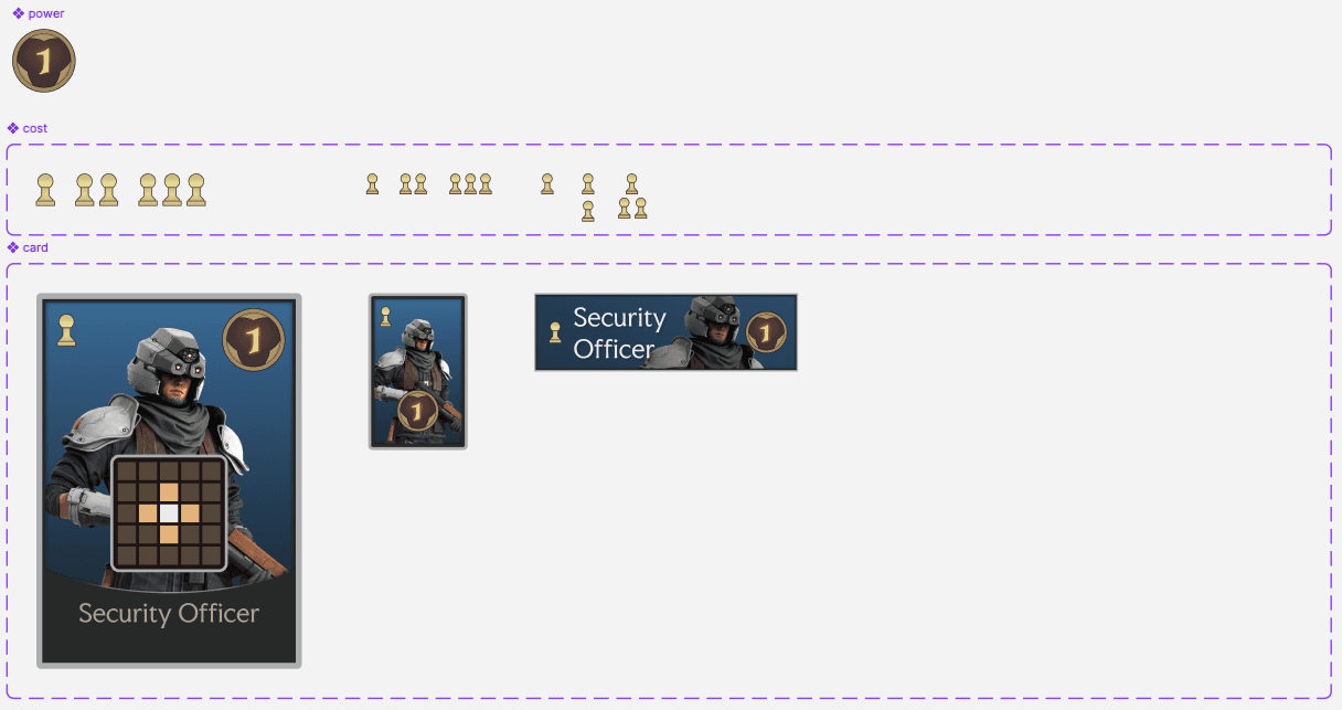
Several card components must be represented on the card at a significantly smaller scale.
Solution
Established different use cases for cards, each displaying varied combinations of card components.
Impact
Leveraged pattern that displays card information as necessary without compromising board size.
Controls
Converting controller inputs to touch UI elements
Issue
Actions on mobile must be accessible with limited screen real estate using only touch inputs.
Solution
Represented standard actions with recognizable icons, sized relative to their importance to gameplay.
Impact
Standardized design of secondary UI elements without compromising access to the controls required to play.
Previewing a card's ability with no 'hover' state
Issue
Selecting and previewing a card, which both require touch, must somehow be differentiated on mobile.
Solution
Mapped interface areas to unique actions, with guidance on use through a mandatory tutorial.
Impact
Minimized opportunity for accidental user actions through a sequential confirmation process.
LESSONS LEARNED
Starting with lower-fidelity sketches is always worth it
Since starting my journey into (graphic) design through digital tools like Photoshop, I had developed the habit of creating polished designs too early. This has historically led me to grow attached to designs, limiting my reception to iteration that I have since learned is vital. I started training myself to start with sketching (whether with paper or anything other than Figma) well before this project, but this was first time I realized a substantial change in turn-around time that I attribute to early design exploration.
